Human Spatial
ComputingAlphabet
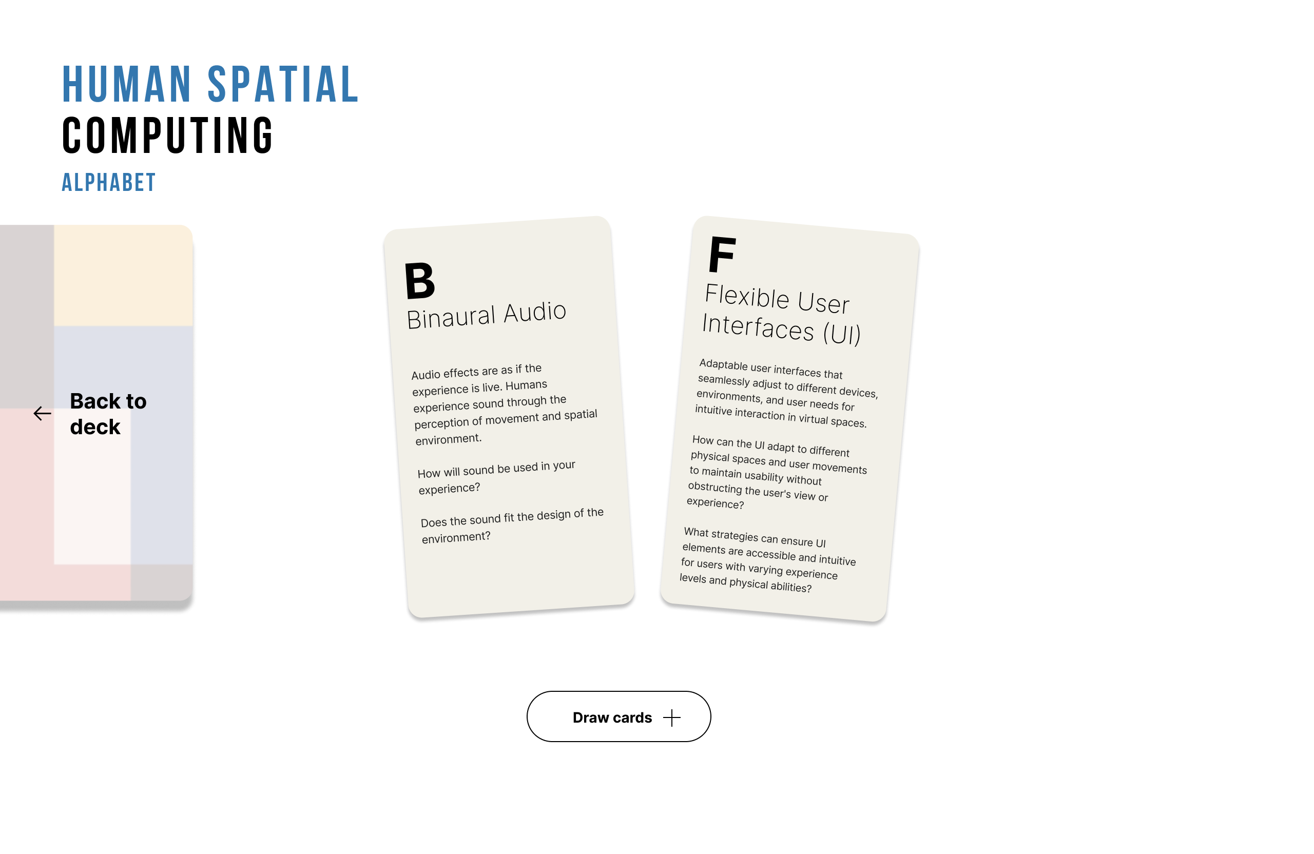
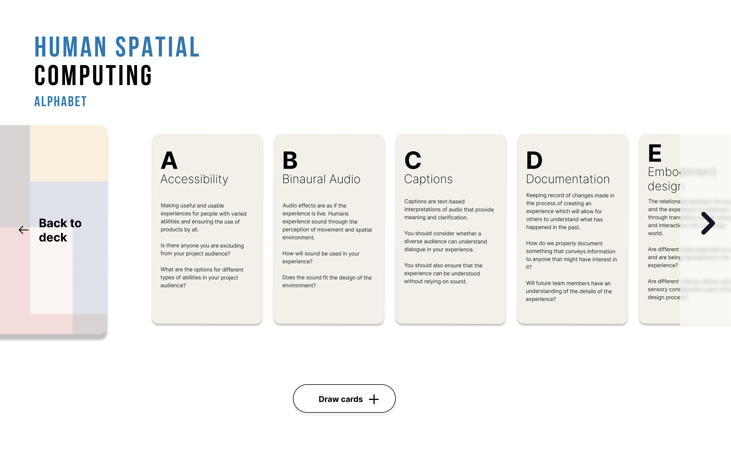
Try it: draw two random cards, or open the deck to browse all 26.
Human Spatial Computing Alphabet
Making XR accessibility teachable, one card at a time
Research Assistant · NYU Tandon
A browser-based card tool that helps educators bring Prof. Regine Gilbert’s alphabet of accessible XR concepts into the classroom, built while researching accessibility in immersive environments.
Context
The Human Spatial Computing Alphabet gives designers 26 concepts, from Accessibility to Zoom, to see, name and question accessibility in immersive experiences.
As a Research Assistant in Prof. Regine Gilbert’s VIP project Defining Accessibility within XR, I worked on standardizing inclusive design in immersive environments with the alphabet. I ran user tests, documented interaction barriers in XR experiences, and shared the findings to inform accessibility guidelines.
The challenge
How might educators use the alphabet in class, so students understand how accessibility concepts relate to each other, not just in isolation?
Four classroom scenarios
Each scenario starts from who the educator is, what they are trying to do, and where XR is being used. Each one uses the cards in a different way.
-
Scenario 1
Connect the cards
Alex is a UX professor at a design school. He wants his students to understand how accessibility concepts relate to each other, not just in isolation. His class is exploring a mixed reality collaboration tool used in remote design studios. Two cards are drawn. How do these concepts support, contradict, or depend on each other in this context?
-
Scenario 2
Apply to a given situation
Maya is a high school history teacher in Brooklyn. She wants to bring a VR civil rights tour into her classroom, but two of her students use hearing aids and one has low vision. All of the cards are displayed. How would you apply these concepts to make Maya’s experience work for every student?
-
Scenario 3
Evaluate an existing experience
Jordan is a curriculum designer at a museum. She is reviewing an AR mobile app the museum uses for guided tours before recommending it to schools. Two cards are drawn. Does this experience consider these concepts? Where does it succeed, and where does it fall short?
-
Scenario 4
Design something new
Sam is an instructional designer at a community college. He has been asked to propose an XR experience for a nursing simulation lab where students practice patient interactions. Two cards are drawn. These are your constraints. Design an experience that puts both concepts at the center.
Version 1: the scenario leads
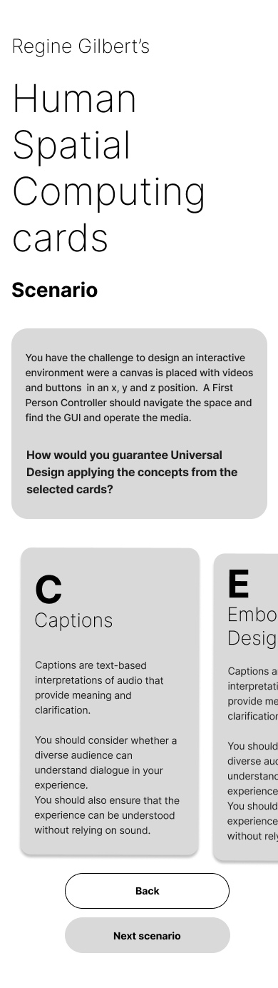
The first prototype put a scenario at the center. Educators started from a landing page, read a design challenge, and applied two drawn cards to it. From there they could sort new cards for the same scenario, or move on to the next one.
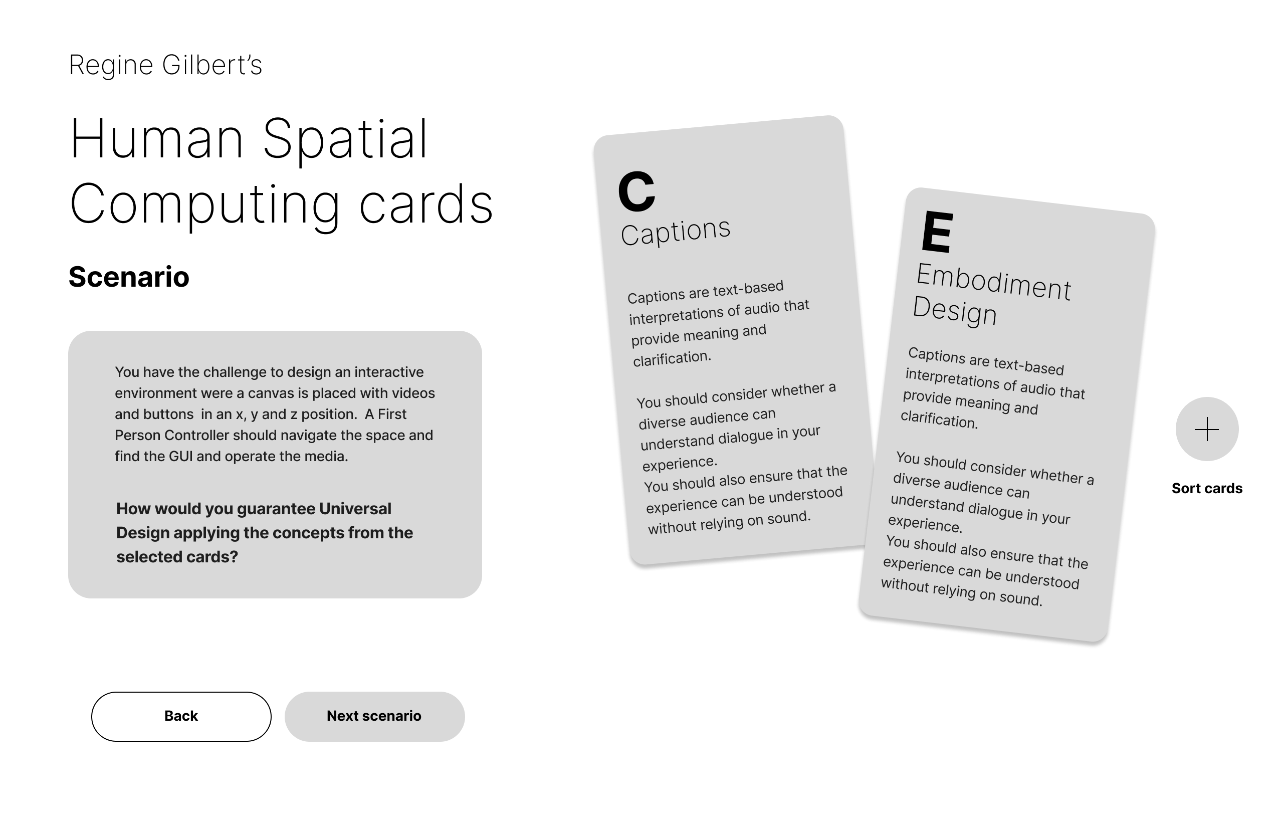
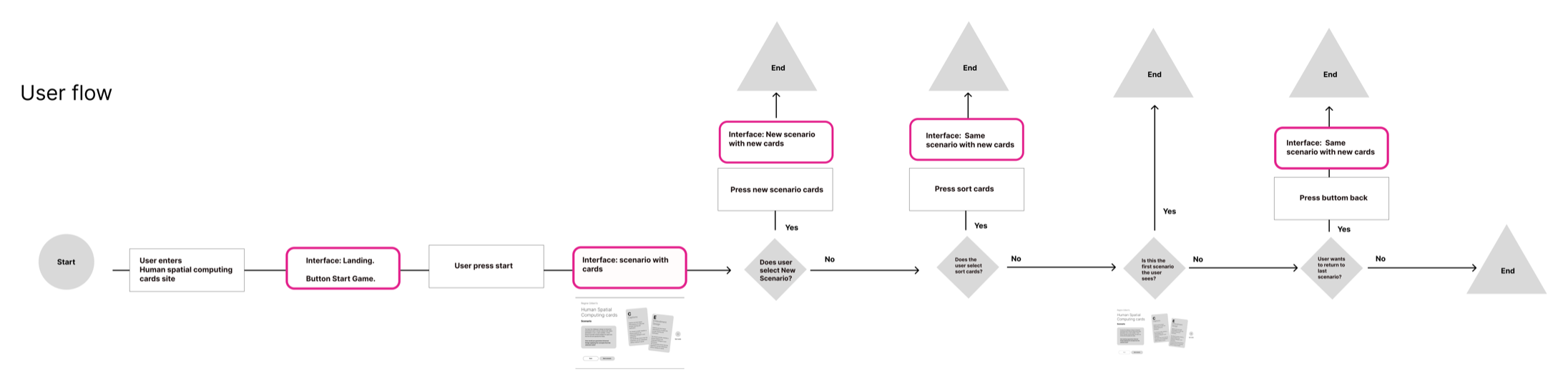
Accessibility, from the first wireframe
- Buttons are operable with the keyboard.
- Calls to action are available to screen readers.
- Screen readers can read the content of each card, and announce that the text belongs to a card.
- Color contrast is checked.
- Color is never the only way information is conveyed.
Version 2: the cards lead
I shifted the focus from the scenarios to the card interaction itself, making the mechanics clearer and more central to the experience. I aligned the visual language of the interface with the card branding for a more cohesive look and feel, and tested motion micro-interactions. Finally, I added “Explore the alphabet” to give educators more flexibility and control over how they engage with the deck.
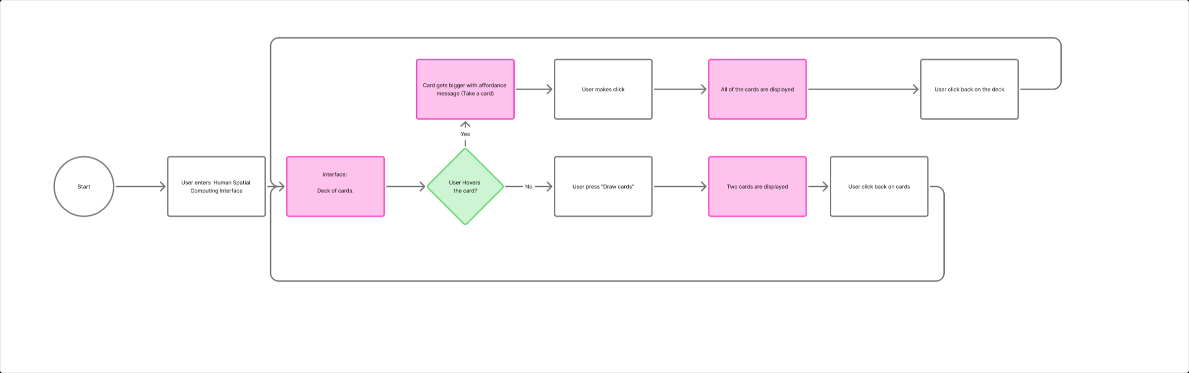
Two ways into the alphabet
- Draw cards pulls two random cards, so a class can stumble upon unexpected pairings.
- Explore the alphabet displays every card, so educators can browse all 26 on purpose.
Both are live at the top of this page.
Accessibility considerations
Who this design supports
Educators who navigate with a keyboard instead of a mouse, and those who use screen readers. The card structure is communicated semantically, so a screen reader doesn’t just read isolated text: it conveys that the content belongs to a card. Color contrast and a minimum text size of 14px support people with low vision, and because no information is conveyed through color alone, it stays legible for people with color blindness.
Who might still be excluded
The tool assumes literacy in English, which excludes non-English-speaking educators entirely.
A trade-off
The random draw is the core mechanic, but randomness is unpredictable. Letting educators filter or pick cards would help those who need more structure and preparation, but removing randomness would change the activity itself. The tool currently prioritizes the pedagogical value of surprise over the need for control.
Reflection
I approached this project with the ableist assumption that accessibility and XR were at odds. I found that XR offers valuable experiences for everyone, and that technology must be designed with universal principles.
Experimenting with different XR tools taught me their constraints. Learning the alphabet itself was one of my biggest takeaways: an acquired language to see, name and spot accessibility opportunities within XR technologies. Overall, I learned that technology is always political, and always involves an ethical position.